

Your online success depends on how well your website is designed and optimized. This is true whether you’re starting fresh or updating an existing site. We’ll dive into the key points that make your site user-friendly, perform well, and elevate your place in search results.
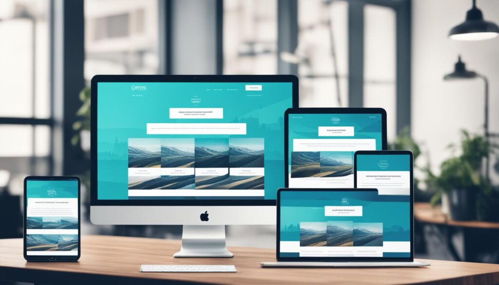
Responsive Design helps your site look great on any device. It easily fits screens of all sizes, especially on smartphones. Media queries and fluid layouts make sure everything works well on desktops, tablets, and phones. Also, it’s important to make sure your site is easy to use on touchscreen devices.
Thinking about User Experience (UX) is very important. Your site’s navigation should be simple and clear. Users should find what they need fast. Clear menus and breadcrumb trails can make navigation even better. Don’t forget to test your site to fix any issues users might face.
Good design also includes a visual hierarchy. This helps guide users through what they see. Using the right typography and white space makes everything look better. Plus, smart use of color can make a big difference.
Creating great content is key. Interesting and high-quality content keeps your visitors engaged. It also aligns with SEO best practices to help more people find your site.
Ensuring your website is accessible is very important. It should be easy to use for people with all kinds of disabilities. Use accessible design techniques to welcome more visitors.
SEO needs to be part of your design plan. This means using the right keywords, titles, and meta descriptions. Also, having a clear site structure and good internal linking can work wonders.
Don’t forget about performance. Make your site fast by optimizing images, compressing files, and using CDNs. This will keep visitors happy with a quick and smooth experience.
Follow these best practices to make a great website. A well-designed site helps your business or project succeed online. Keep in mind, your website is the starting point for a great online presence.
Key Takeaways
- Implement responsive design to ensure your website is mobile-friendly and adapts to various screen sizes.
- Prioritize user experience (UX) by designing intuitive navigation menus and incorporating breadcrumb trails.
- Establish a clear visual hierarchy through strategic use of typography, white space, and color.
- Develop a compelling content strategy that aligns with SEO best practices to improve visibility and engagement.
- Ensure your website is accessible and inclusive by adhering to WCAG guidelines.
- Integrate SEO principles into your website design to boost online presence and attract the right audience.
- Optimize website performance through techniques like image optimization, file compression, and CDN usage.
Responsive Design: The Key to Mobile-Friendly Websites
Today, many people use their phones to go online. So, it’s important to have a website that works well on phones. This is where responsive design comes in. It makes sure your website looks good on any screen, like a computer, tablet, or phone.
Fluid Layouts and Media Queries
Responsive design works by using fluid layouts and media queries. Fluid layouts make everything on your website adjust to fit the screen. Media queries help by changing how the website looks, depending on the device. Together, they make your website work well for everyone.
Optimizing for Touchscreens
With more people using phones, it’s key to make websites easy to use with a finger. Responsive design makes this happen. It makes buttons and links easy to tap on. This way, your website is easy to use, and people like visiting it.
Enhancing User Experience (UX) with Intuitive Navigation
Putting user experience first is very important in making a website. One big part of that is the navigation. It needs to be easy and obvious. Clean menus that make sense help people find what they need fast. They are like a guide, making sure visitors get where they want to go.
Clear Navigation Menus
Good navigation menus are key for a site that’s easy to use. By putting menu items in a clear order, users can move around your site easily. Keep similar topics together and use clear labels. This makes finding things fun and not frustrating.
Breadcrumb Trails
Breadcrumb trails are another helpful way to improve your site’s navigation. They show users exactly where they are on your site. This helps them remember where they’ve been and easily move back. It makes exploring your site feel easier and more under their control.
Usability Testing
It’s important to often check how easy your site is to use. Watch how people use the menus and other parts of your site. This shows where things might be confusing. By acting on what you learn, you can make your site better and easier to use. This way, everyone who stops by can have a great time browsing.
Visual Hierarchy: Guiding Users Through Content
Good website design uses a clear visual hierarchy. It helps users know where to look. This is done by the way typography and white space are used. They make the site look neat and interesting.
Typography and White Space
Choosing the right fonts and their size is key. It makes what’s important stand out. Also, it keeps things easy to read. Designers make the page look good and work well by doing this.
White space isn’t just empty space. It’s used to make the page feel less crowded. It also helps to focus on important stuff. A page with the right amount of white space looks professional and is pleasant to use.
Color Psychology
Colors help set the mood of a website. They can make people feel certain ways. Using colors right can point out what’s most important. It makes the site more fun and helps people remember it better.

Crafting a Compelling Content Strategy
Creating a great content plan is key for good website design. It means making valuable, interesting website content and sharing it with your people. This will make them more happy and keep them coming back. Also, using content strategy and search engine optimization (SEO) together helps grow your website’s views and get more relevant visitors.
To start, learn all about your audience. Find out what they want, like, and need. Use this to shape your content and meet their specific needs.
Then, pick a schedule for sharing your content. Mix things up by posting blogs, articles, videos, and more. This keeps your website fresh and interesting.
Make your content friendly to search engines by using the right keywords. Also, make sure it’s easy to read and use. This makes both visitors and search engines like your site more.
So, by planning your content well, your website will be more useful and fun. It will also do better on search engines, which helps your site a lot.

Accessibility: Designing for Everyone
Accessibility must be a top concern when designing websites. Follow the Web Content Accessibility Guidelines (WCAG). Doing so makes your site welcoming for those with disabilities.
This includes people with vision, hearing, motor, and thinking problems. Use accessible design to help more people use your site. This also boosts your site’s SEO.
Web Content Accessibility Guidelines (WCAG)
The WCAG are from the World Wide Web Consortium (W3C). They help make websites easy for everyone to use. By following these rules, you make your site good for all. This means anyone can easily see, use, and understand your site.
Assistive Technologies
Using assistive technologies helps more people reach your site. Things like screen readers and speech-to-text tools are important. They help those with vision, hearing, or movement challenges use your site better.
Make sure your site works well with these tools. This lets you design for everyone. Your site will be more helpful and welcoming.

Website Design Best Practices for Search Engine Optimization
Adding SEO tips to your site design is key. It helps your site be seen and brings in the right visitors. Using many tools makes your website better and more inviting.
Keyword Research and Optimization
Start by looking at what words are best for your site. Find the ones that match what your site is about. Use these words in your site’s info and setup. This makes it easier for people to find your site online. Then, more people might visit it.
Structured Data and Schema Markup
Using special data formats and tags can make your site stand out in searches. This makes your info clearer to search engines. They then show your site better in search results. It’s like making your site shine more online.
Site Architecture and Internal Linking
How you organize and link your site is very important. A clear structure helps search engines understand and show your content. Linking pages inside your site also helps. It shows what pages are most important. This way, your site does better in search results.
Performance Optimization: Faster Loading Times
Faster websites create better experiences for people. Making your site fast helps it show up better in searches too. Focus on making your site speedy to give your visitors a great time.
Image Optimization
Big images slow your site down. But by making them smaller, you keep your site fast and pretty. Always pick the best image types and sizes for your page to load quickly and look good.
Minification and Compression
Big pages can be made smaller. You do this by getting rid of extra stuff in your code. Also, you can crunch code down to a smaller size. Both ways make your site load faster and feel better for visitors.
Content Delivery Networks (CDNs)
CDNs are like helpers for websites. They keep some of your site stuff in places all over the world. When someone visits your site, they get your content from the closest spot. This makes everything load quicker and work smoother for everyone.
Following these steps will make your website faster and better. With optimized images, small code, and CDNs, you make your site a joy to visit. Speeding up your website is key to make a good digital home for your content.
Secure and Compliant Website Design
Keeping your website security and following rules are super important in web design today. One key step is using SSL/TLS encryption. It makes sure messages between your site and users stay private. This keeps important info safe, like logins and payment info.
Along with tech safety, making your site fit with rules like the General Data Protection Regulation (GDPR) shows you care about data privacy. It makes users trust you more. You offer a clear, respectful experience. This makes a difference.
Choosing website security and following rules helps protect your online stuff. It makes your site a safe place to be. This benefits your users and your business. It also makes your site work better.
By using these website design best practices, your site can be great. It becomes easy to use and fast, giving everyone a good time. Good design and easy page clicks are key to winning online.
Follow these tips for a site that’s always there for your users. Make it welcoming and safe. Also, get more visitors with the power of search engine optimization.
For a top-tier site, remember some key things. Make it fit any screen and focus on what people want. Good stories on your site help too. Also, keep it easy to get to, and make sure your site loads quickly and is safe. By always doing these things, your site will be a winner in digital land.
Keep your site safe by using encryption. This protects your visitors’ information. Also, follow important data privacy laws to show you care about your users.